


Meta Business Help Centre
Best practices for image ads

Note: There is no longer a limit on the amount of text that can exist in your ad image. The text overlay tool is no longer available.
People scan Feed quickly, particularly on mobile devices, so consider how to draw their attention.
Testing your ad is the best way to find what works for your audience, but these techniques can be effective.
- Use the recommended aspect ratio for each placement. Different placements across Facebook, Messenger, Instagram and Audience Network require different aspect ratios. You might use a 1:1 ratio for Facebook Feed and a 9:16 ratio for Instagram Stories. Note that you can use the same image with multiple placements and ratios by using the asset customisation features in Ads Manager.
- Use high-resolution images. See our minimum pixel size requirements and use the highest-resolution images available. Avoid overly photoshopped images.
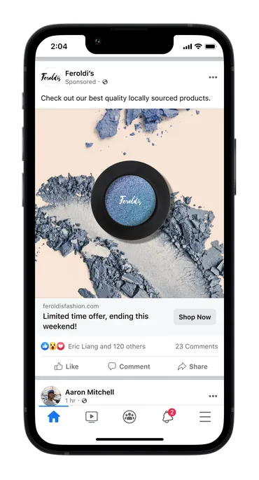
- Show your brand or logo. People engage more with brands they know, or brands which show they are credible.
- Show people using your product or service. This helps people visualise themselves doing so. It can be effective to show people similar to those you are targeting.
- Consider text overlays. If you want to add text to an image, it shouldn't obstruct the visuals. Use a modern, clean font in a large enough type size and a contrasting hue.
- Focus your message. Keep the attention of your audience by cropping tightly around the important part of the image. To show multiple images in the same ad, we recommend the carousel format.
- Consider colours, palettes and filters. Use appealing colours appropriate for the content, such as bright tones for a summer sale or calming pastels for a spa.
- Preview your ads. Use Ads Manager preview to experience your ads as your audiences will on computers and phones. You can preview your ad at any point during ad creation.
Learn more


 Log in to Meta for Business